Each year, right at the beginning of it, we all look forward to see what the new colour trends will be in the market. A colour trend has a deeper place of origin. You see the specialists who come up with those colour trends, actually look into society, and what people normally “like” as a preferred colour.
One of the ways to identify mostly preferred colours throughout a mass of population are the search engines that we use, mostly on pictures. Through algorithms, those search engines identify the primary colour located in the picture.
Therefore, a colour trend is a point of view. A developing awareness or an emerging preference for a colour or a specific palette. Thus, such a trend holds the power to change the way we perceive it and how we purchase consumer goods. Concluding, colour is reduced as a means of communication.
For this year the major colour specialist came up with the following two (2) colours:
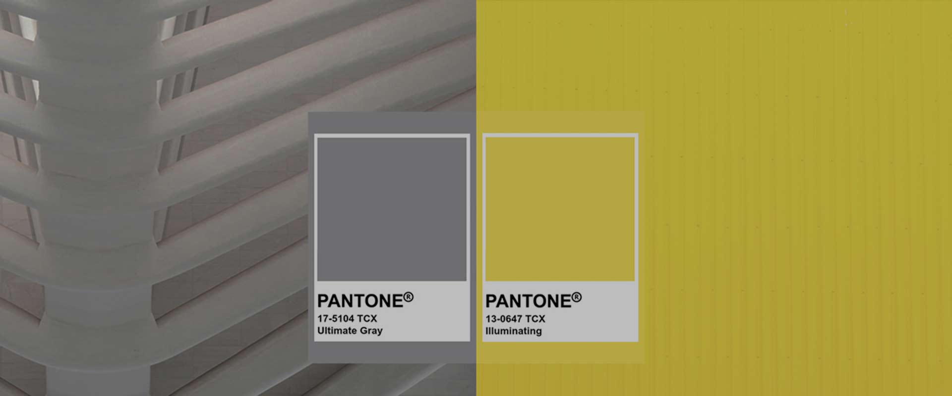
1. Ultimate Gray PANTONE 17-5104
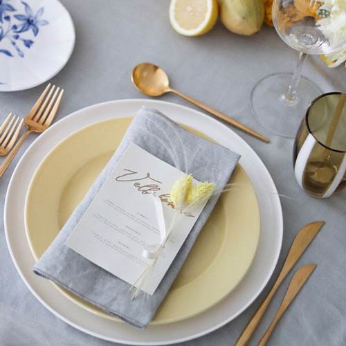
Having gone through a tough, unexpected year, and still fighting with every hope to get out of this Covid situation the sooner the better, we need this Ultimate Gray to ground us, to indicate mindfulness and the rock solid spirit we need to maintain throughout the current situation. It’s an earthy, dependable element and equally diverse, as it merges with both light and darker elements.
Personally, it is one of my favourite colours. I find it subtle, whilst can be combined with all kind of bright colours, compliment and elevate them. Even though it is minimalistic, it is a trustworthy element to step on to as it can give great space for growth and freedom for creating with other bolder elements. It is perfect for those who would like to stand out, without compromising a pure minimalistic, therefore chic, style.
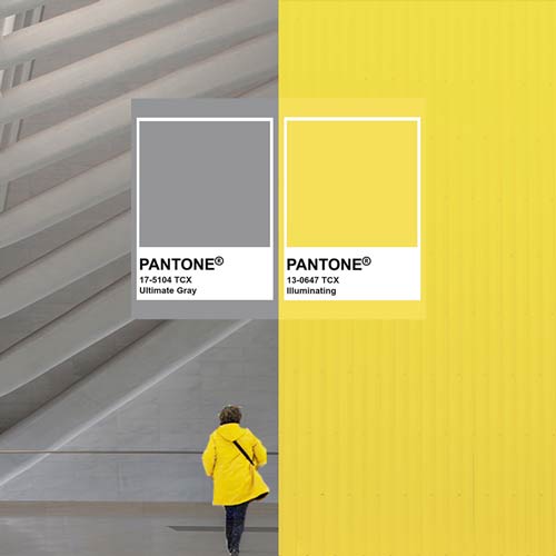
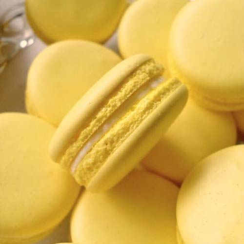
Now on the other hand we have the Illuminating Yellow. A bright colour that can easily be resembled with the shinning gold. We need some optimism, happiness and joy these days. We’ve seen pretty dark days and we need some light to be shed in.
It is so amazing how these two colours are so different from each other, yet so complementing. The Illuminating Yellow, upon the Ultimate Gray, gives more emphasis, a sense of greater energy and clarity. I love this yellow because it reminds me those amazing bright yellow Sfusato or Sorrento lemons of Italy, utterly fresh, juicy and zesty. And what could have been more ideal for “fresh” starts, new beginnings, with bright future on solid ground!
A marriage of colour conveying a message of strength and hopefulness that is both enduring and uplifting. (Pantone)
Yet another colour specialist is bringing its own twist and version of this year’s colour trends.
Shutterstock; it is a global provider of stock photos. People visit to download pictures for personal and professional use. And based on that the colours that were most popular and appear to be the trend for 2021 are:
Set Sail Champagne #FAEBD7
That earthy champagne colour is another proof that people are leaning towards softer, organic tones, similar to the turn of attitude that people embodied over the last year. The need to lean more towards nature and the sense of escapism from our daily concerns. And once again is a soft colour that can compliment brighter ones, or be matched with any other pastel palette.

Fortuna Gold #DAA520
Fortuna gold is a warmer, deeper yellow colour. Once again we see the need for that yellow in this year’s colour palettes, as it indicates the hope and the good luck for better days. Gold is a timeless value, with many shades, and in any version of it, it can be complemented by many other softer, darker or even brighter colours. It can be subtle, or it can be used to stand out, and give that extra glamour, to any kind of elegant, minimalistic or aethereal styles of your events.
Personally I can see it being used frequently in this year’s preferences, as many people would like to add that extra value in their lives, having gone through a year of self-re-evaluation.

Tidewater Green #2F4F4F
Our final colour, Tidewater Green, is quite the mystical colour of this year’s selection. No wonder people would turn to something darker, after a year of uncertainty and wonder. But if you pay more attention, the choice of that colour, is still organic and natural. We come across with it, mostly in nature, the darker forests, a lot of herbs, and by its name, those deep water tides. That shows the need for the people to escape, and feel free, in a natural environment, away from what constantly keeps us concerned.
Tidewater green is a colour that can be combined and complimented perfectly with other earthy and some pastel colours, whilst definitely with brighter colours like Illuminating Yellow, or Fortuna Gold. It can certainly add a mystery or a more sophisticated classy whilst natural and organic element to your events.

I hope you enjoyed the colour trends of 2021, and for me personally I can’t wait to use and apply them on your special day.
Till our next blog time, enjoy those little moments in your day, every day!